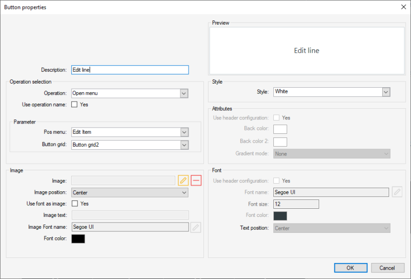
Button Properties
To configure a button in a menu use the operation button properties:
- Open the LS POS;
- Hover the cursor over the button that you are going to set up or change;
- Right click;
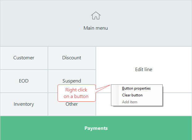
- Select Button Properties.
Item Sale button
Create a button that sells a selected item when pressed:
- Select the button to setup and right click on this button.
- In the Button properties dialog set Operation as Item Sale.

- Select the check box for field Use operation name.
- In the field Item, select the item from the drop-down list.
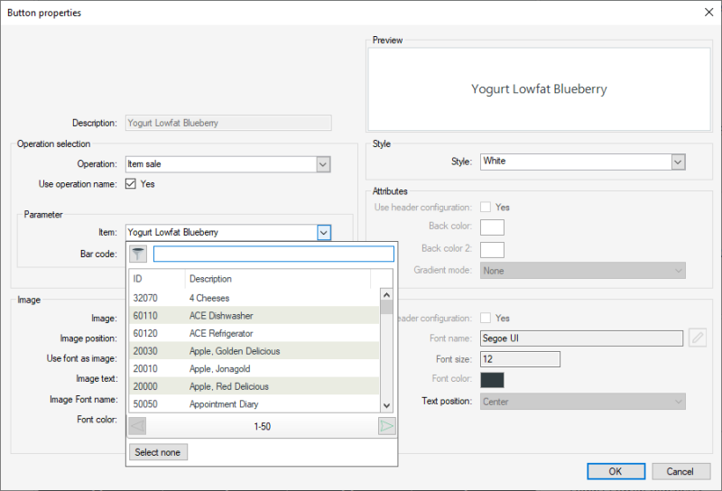
- Press OK and the button is ready to be used.
This example uses the operation Item Sale, which defines a button to sell items.
To view a full list of LS POS operations read here.
Button properties field help:
| Tab/Field name | Description |
|---|---|
| Preview | Shows a preview of the button according to the setup. |
| Description | Text that is displayed on the button. |
| Operation selection | |
| Operation |
There are over 100 operations in the system. Some of them are already on buttons in the Demo Data. You can set up the POS layouts differently, changing the menus and operations in them.LS One POS Operations |
| Use operation name |
When this field is selected, the description will automatically have the operation’s name. It is possible to overwrite the default description by clearing this field and then editing the description field. |
| Parameter |
The fields for this box change depending on the Operation. Some operations do not require operation parameters while others do. There can be none to two selection fields with settings for the button functionality. For an example if you select the Item sale operation then a item selection field and a barcode fields appear in this box. |
| Image | |
| Image file |
Browse for an image to add to your button. |
| Image position |
Select where the image should appear on the button:
|
| Use font as image | Select this to enable the following fields to select an image font to add to the button. The good thing about image fonts rather than image files is that you can change the color of the font do match your design. Webdings is an example of an image font. You can also create your own image font with free tools from the Internet. |
| Image test | Enter the symbol for your image |
| Image font name | Select the font to use |
| Font color | Set the color of the image font. |
| Style | |
| Style | Select a predefined style to set color, style and font of the button |
| Attributes fields |
Configure the color of the button. Gradient mode allows you to make the button look more three dimensional. |
| Use header configuration |
When the check box is selected, the color setup of the button are retrieved from the menu header configuration. If the check box is clear, this button can be customized separately. |
| Font fields | These fields are accessible when the Use header check box is clear. It is possible to edit the font, the font style and the size. |
| Use header configuration |
When the check box is selected, the font setup of the button are retrieved from the menu header configuration. If the check box is clear, this button can be customized separately. |
| Updated: | June 2020 |
| Version: | LS One 2020 |

